Purple is the new blue for
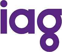
IAG, which has had a brand overhaul and plumped for a vivid purple colour to replace the traditional financial services colour blue, and switched upper for a more funky looking lower case text.
It is matched with a circular theme and has dropped Insurance Australia Group from its logo.
The company has said it wanted a new look which would enjoy longevity and that gave an image of leadership.
IAG New Zealand CEO Jacki Johnson said the move was to make IAG look more distinctive and progressive and signalled a new exciting phase for the company.
“The new identity better reflects IAG’s position as the general insurance market leader in Australia and New Zealand, with an emerging footprint in Asia,” she said.
“We’re also operating in a more digitised environment so it is important that the brand identity is flexible and adaptable for use across all marketing channels and mediums as well as stretch across geographical boundaries.”
IAG New Zealand’s EGM of strategy, people and reputation, Martin Hunter, said the new look also reflected the ‘increasingly integral role’ that the company played in the community, not just with shareholders.
He said therefore it was important that the new brand identity created a sense of warmth and approachability.
“The new brand identity is centred on creating confident futures and is designed to help differentiate IAG from the insurance crowd.”
Hunter said over time there would be a stronger visible link through the consumer brands, which include
NZI, Lantern,
Lumley,
AMI, State and NAC, to IAG.
“Our research shows the majority of customers value knowing who stands behind the insurance brands they choose to purchase from, particularly the financial security, strength and scale that comes from being backed by IAG.”
While the company stopped short of admitting they were trying to attract the millennials, a quick look at the video reel with its flashing lights, dance music, and djs speaks for itself.
IAG group general manager Chris Jackson said the biggest challenge was devising a brand that could stand the test of time.
"It was being able to think about what our future custodians are looking for," Jackson told Australian website
Mumbrella.
“You are making decisions about something that will be around in 10 or 15 years.”
He said the colour purple was chosen for its strong association with leadership.
However, some industry commentators were less impressed, and questioned the amount of money spent on the campaign, which was created by brand agency Landor.
What do you think of IAG’s new branding? Let us know in the comments section.

 Purple is the new blue for IAG, which has had a brand overhaul and plumped for a vivid purple colour to replace the traditional financial services colour blue, and switched upper for a more funky looking lower case text.